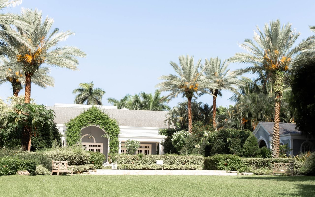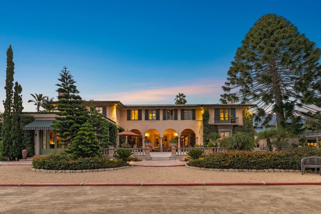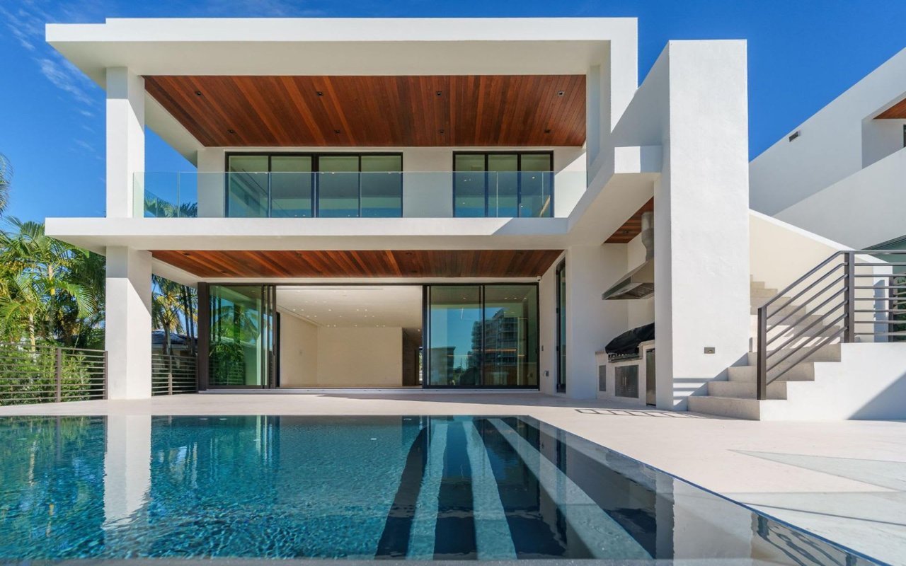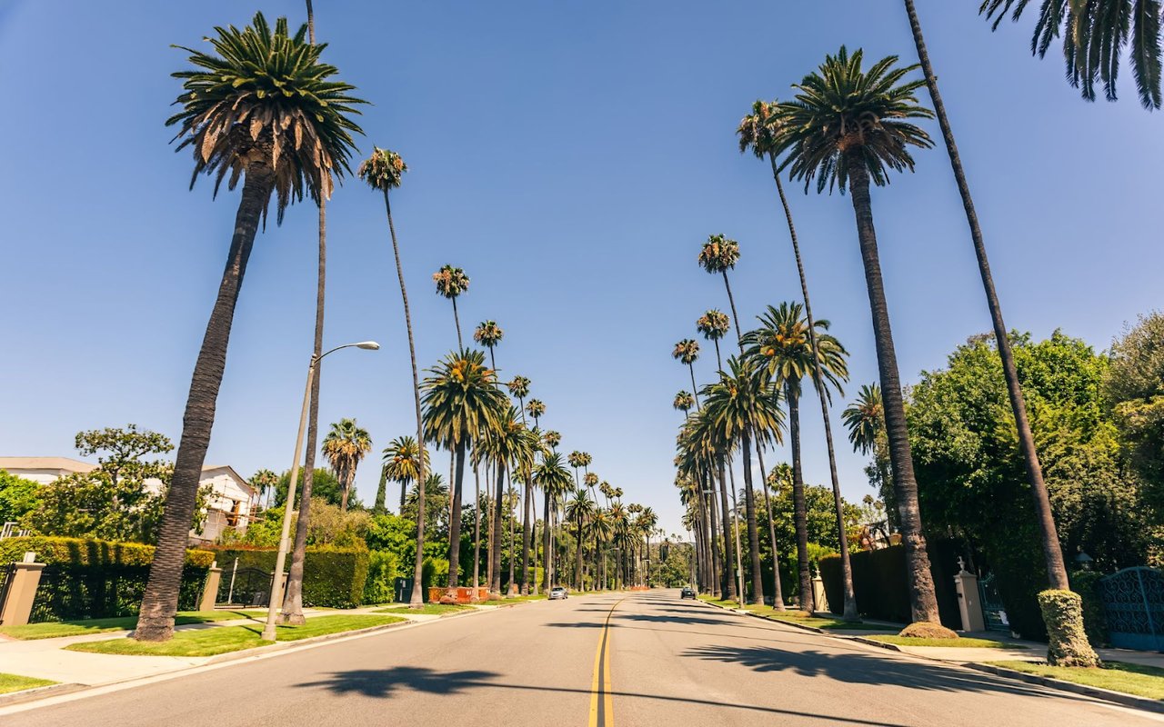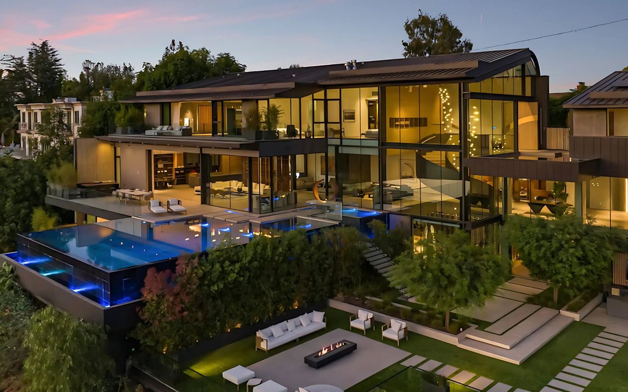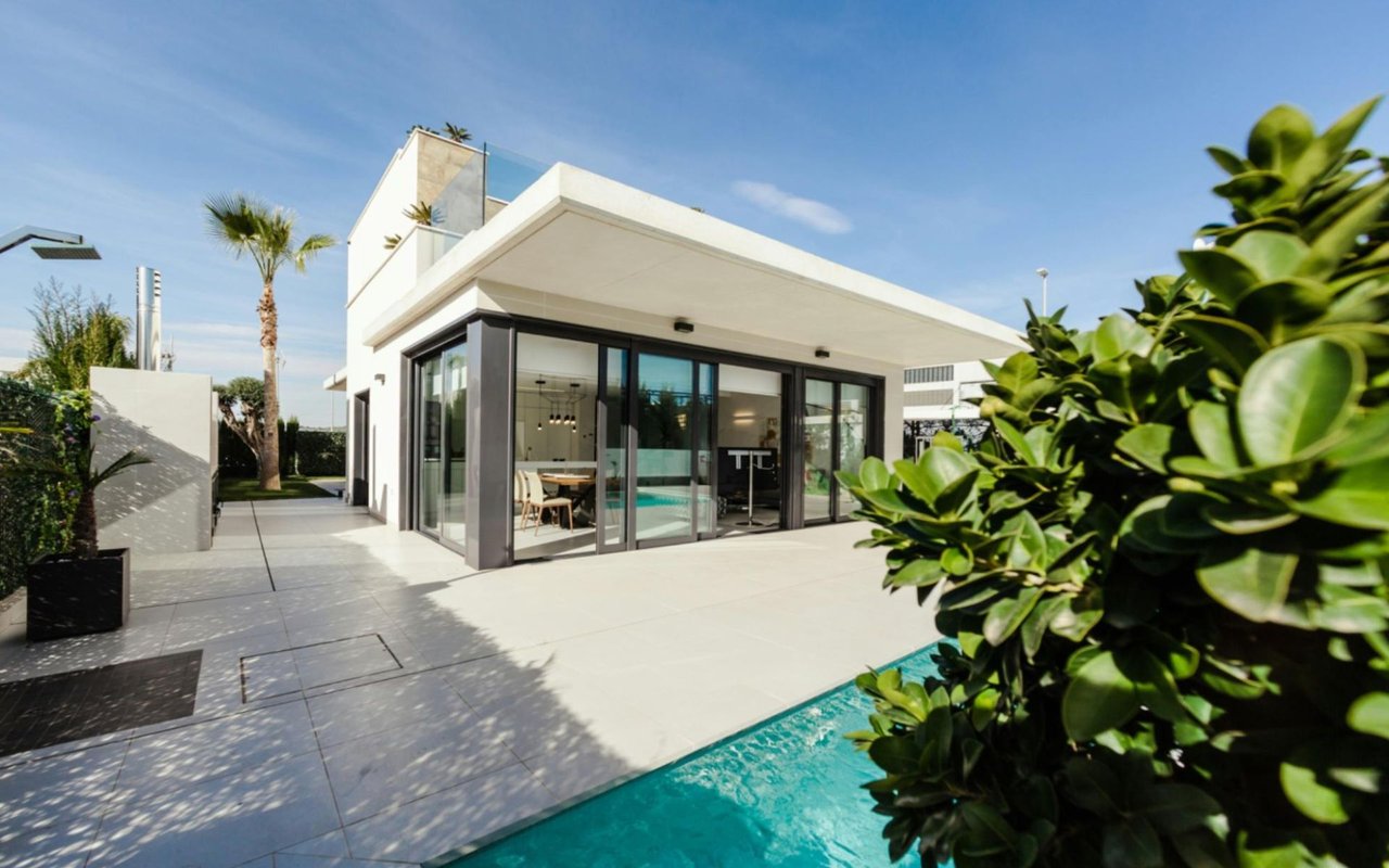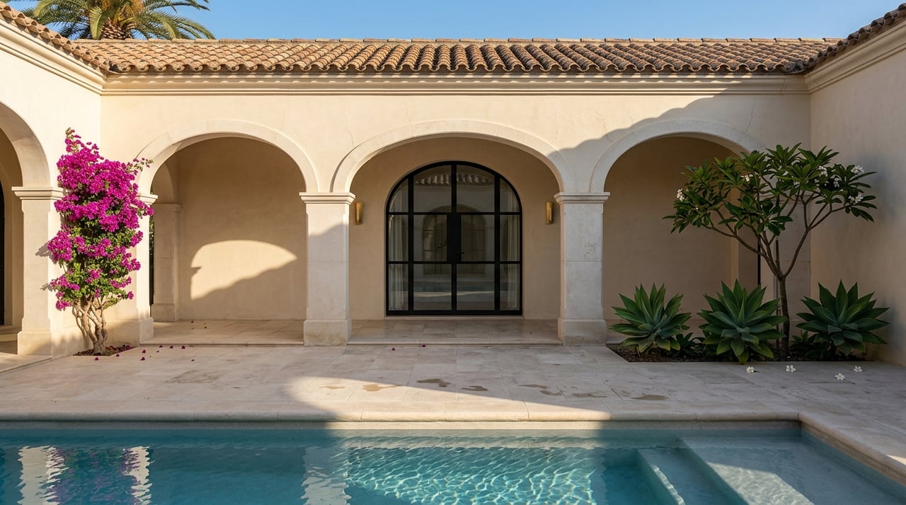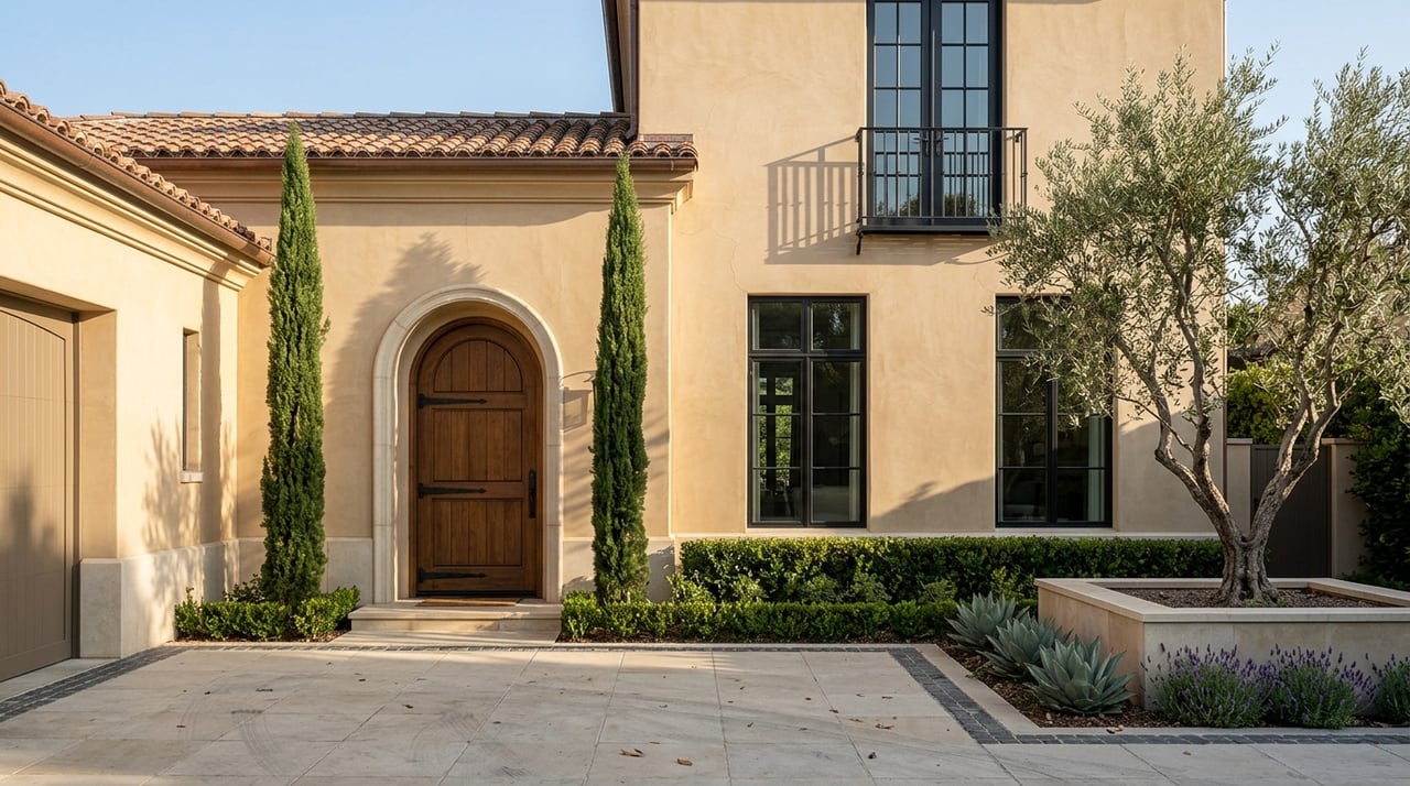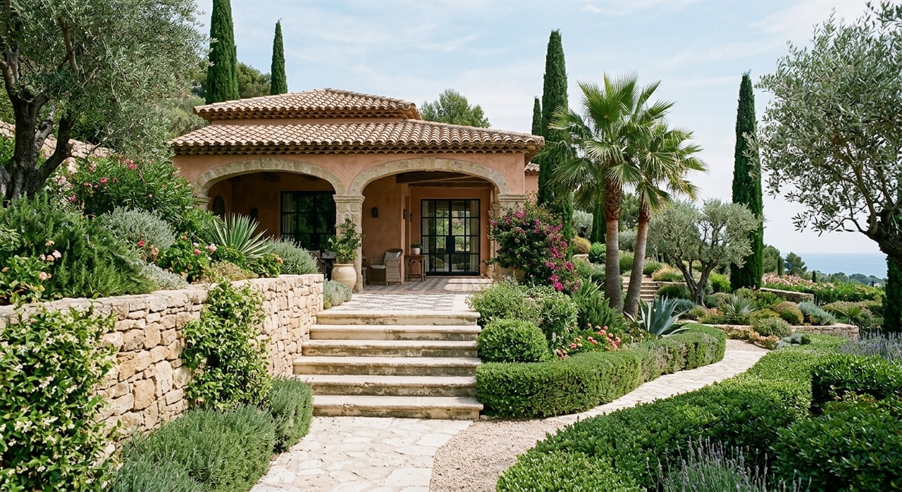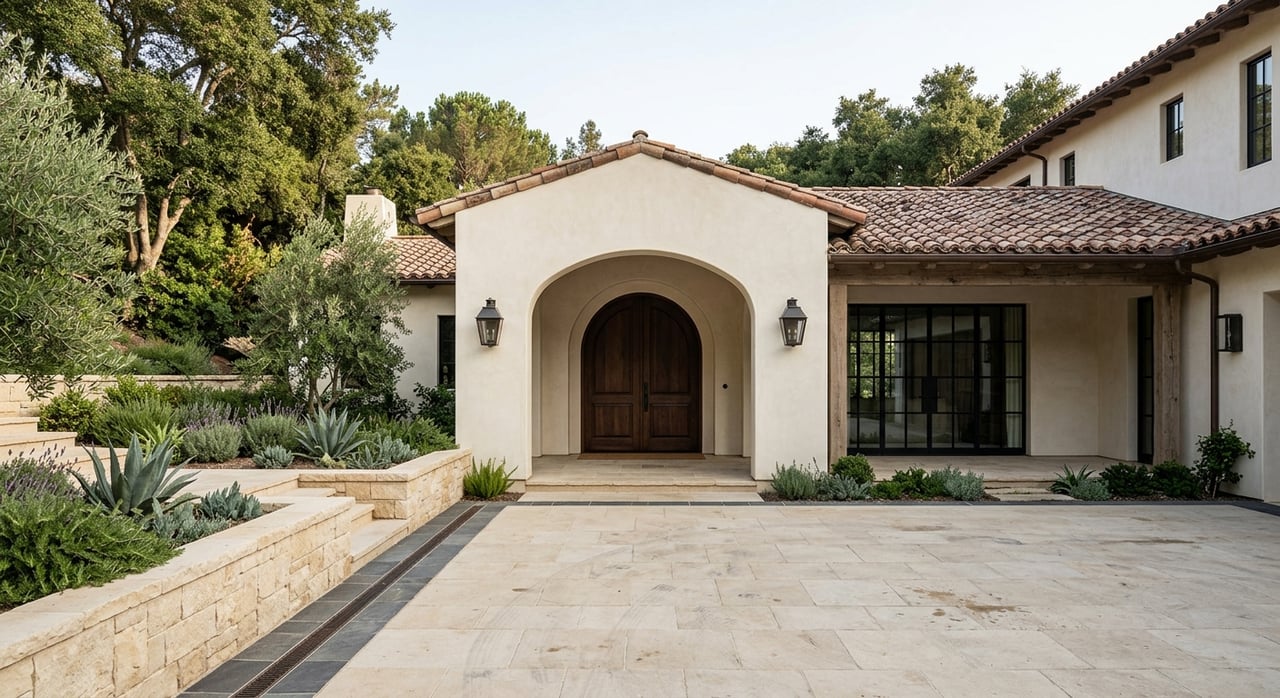
Color has power. It influences your mood, changes how large or small a space feels, and shapes how people experience your home. When you're choosing paint colors for your Beverly Hills home, you're not just selecting hues from a swatch — you're crafting an environment that tells a story about who you are, how you live, and the atmosphere you want to create.
In a market as visually influential as Beverly Hills, where luxury design and elegant personal style go hand in hand, paint color becomes more than just a finishing touch. It’s part of the architecture and the experience. Whether you're redecorating a single room or transforming your entire property, understanding the science of color will help you make choices that enhance every inch of your living space.
Understanding Color Psychology
Before you pick up a paintbrush, it’s crucial to understand how color affects behavior and perception. The psychology of color explores how different hues evoke emotional responses, and these responses can influence how relaxed, energized, or focused you feel in a room.
Warm colors like red, orange, and yellow stimulate the senses and are often used in spaces where you want energy and conversation. These tones can add vibrancy to a dining area, create warmth in a sitting room, or even bring a cheerful touch to a hallway.
Cool colors, such as blue, green, and violet, are calming and restorative. They’re ideal for bedrooms, bathrooms, or quiet reading spaces where serenity matters. Neutral tones, including gray, beige, and taupe, act as sophisticated backdrops and blend seamlessly with high-end furnishings and modern architecture.
When you're redesigning your Beverly Hills home, don’t just choose what looks impressive on a sample. Think about how you want to feel in the room and how the space should feel to others.
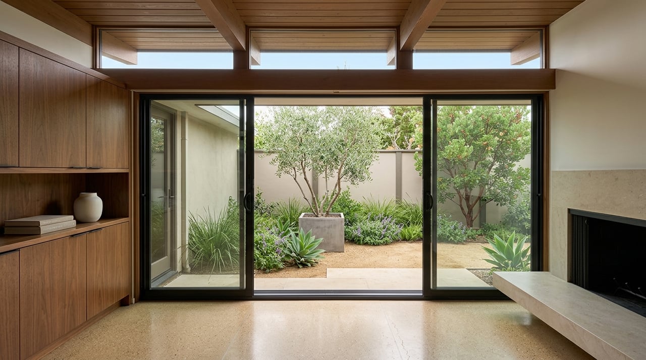
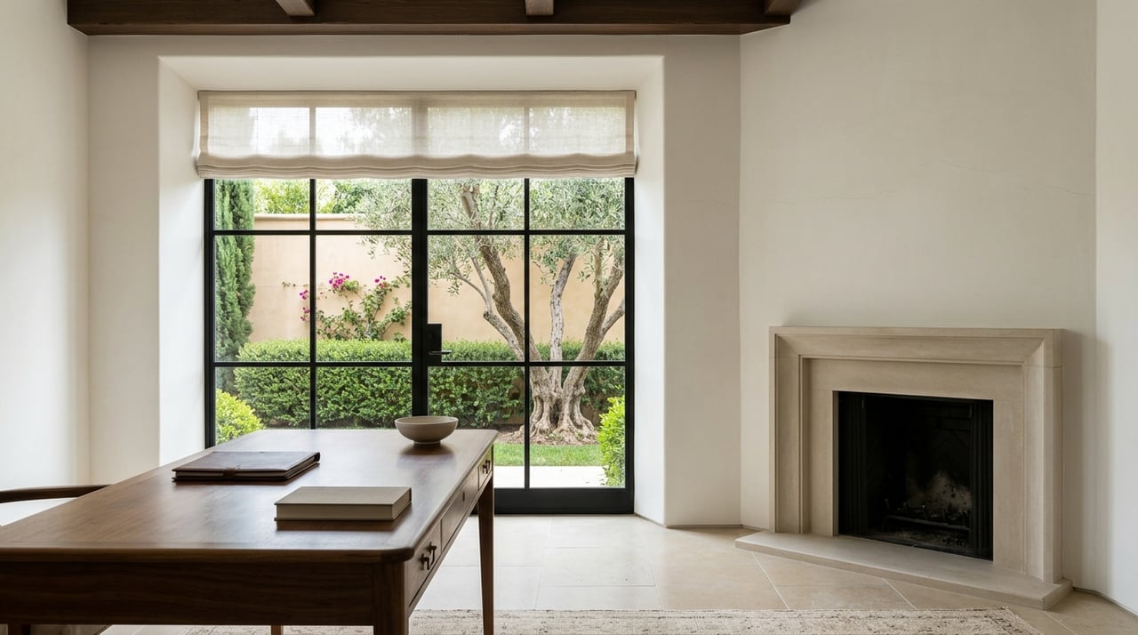
Using Light To Your Advantage
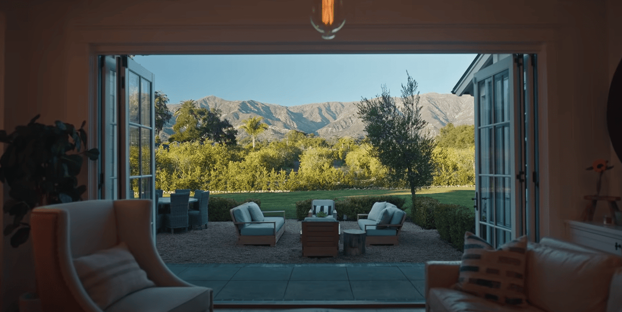
The lighting in your home plays a major role in how color appears. A paint tone that looks rich and balanced in the store might look completely different under the unique lighting conditions of your property.
Natural light changes throughout the day. Morning sunlight has a soft, cool tone, while afternoon light is warmer and more intense. In rooms with oversized windows or skylights, your paint will shift in tone depending on the time of day, creating dynamic visual interest — or revealing undertones you hadn’t anticipated.
Artificial lighting matters just as much. Incandescent bulbs give off a warm, yellow glow that enhances reds and oranges but can mute blues and greens. Meanwhile, LED and fluorescent lighting can bring out cooler tones or make a color appear more sterile than expected.
Before committing to a color, test samples in the room at different times of day and under both natural and artificial lighting. Watch how the hue behaves, and ask yourself whether it supports the ambiance you're trying to achieve.
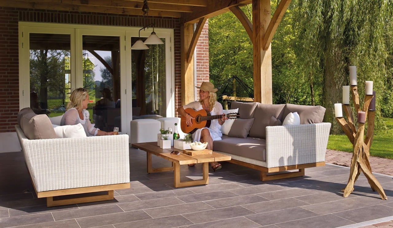
Creating Flow Throughout Your Home
Cohesiveness is a hallmark of great design. In a home with multiple rooms and open floor plans, color flow ensures that one space leads gracefully into the next.
This doesn’t mean every room should be painted the same color. Instead, choose a palette of complementary tones that work well together and tell a visual story from room to room. Soft variations of the same hue can provide subtle transitions, while distinct colors with shared undertones create harmony even in contrast.
An easy way to unify your space is to select one or two neutral anchor tones that recur throughout your home — on trim, ceilings, or shared wall areas — and then layer in more personalized colors for specific rooms. This method keeps your design sophisticated and intentional while still allowing for expression and variety.
Choosing Colors For Specific Rooms
Each room in your home serves a different purpose, and the paint tones you choose should enhance how that room functions and feels.
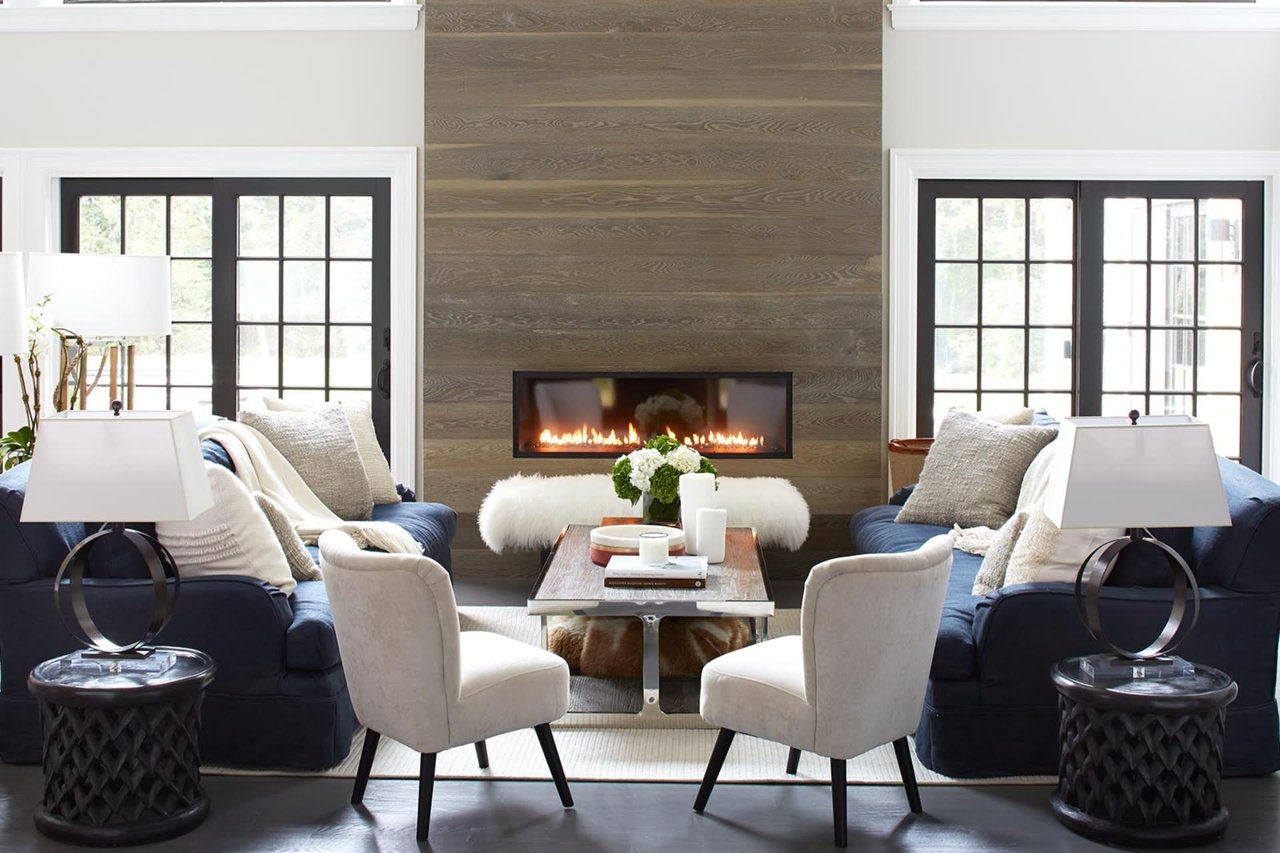
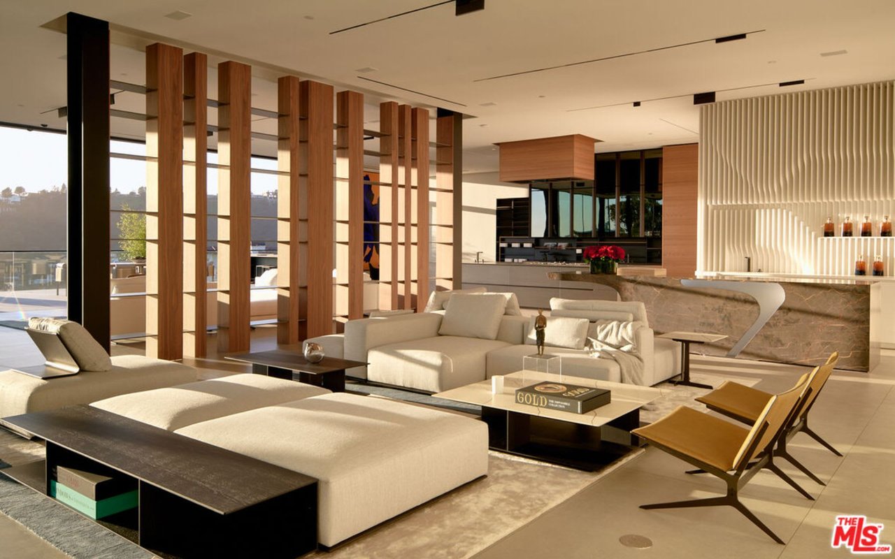
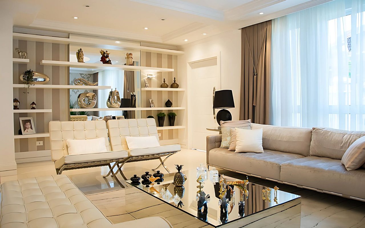
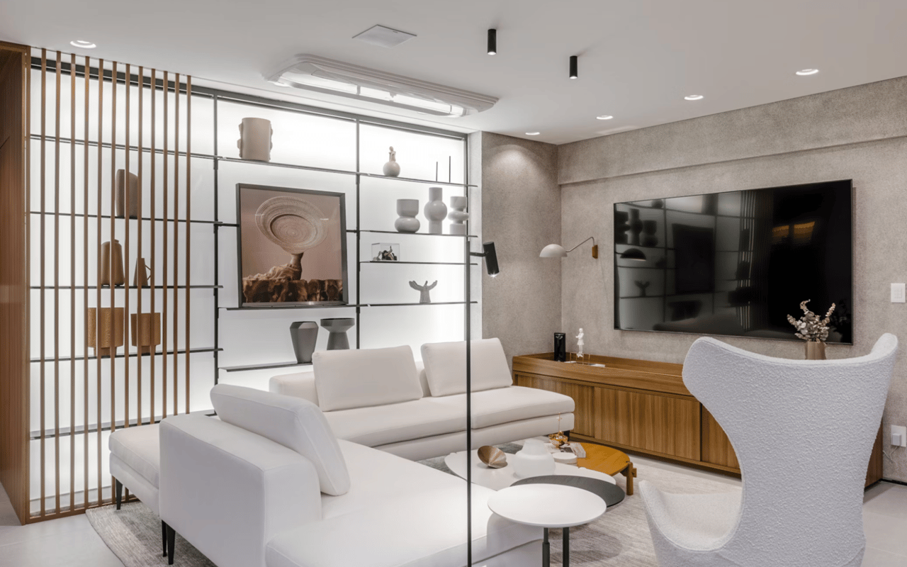
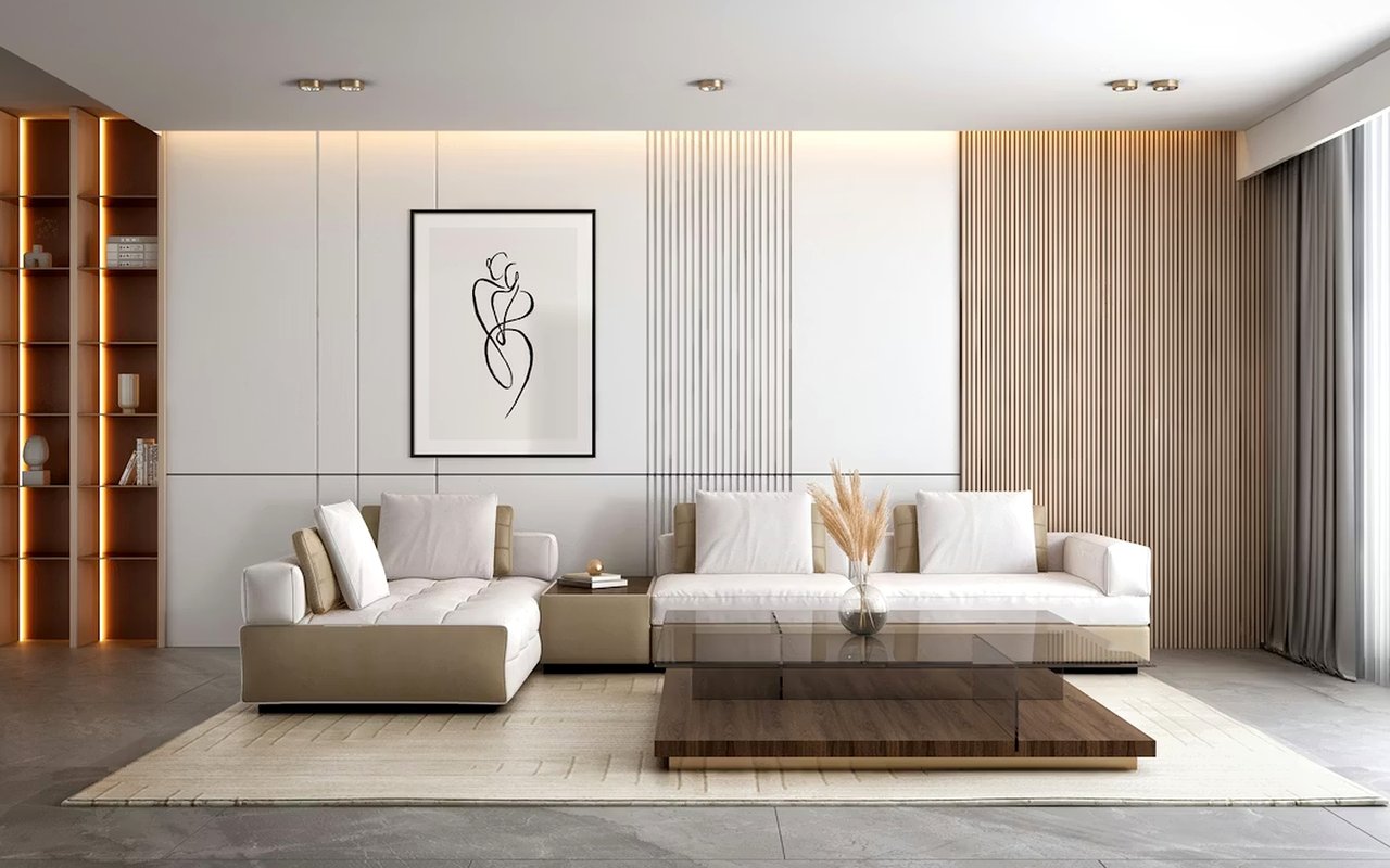
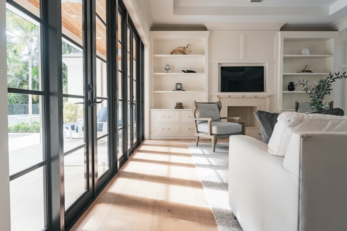
Living Room
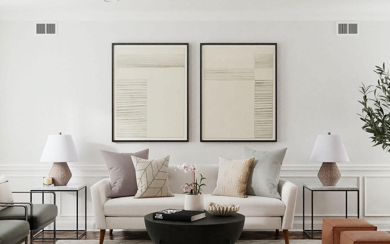
As one of the most frequently used areas of your home, your living room should feel both inviting and refined. Soft grays, warm taupes, and creamy whites provide a luxurious yet understated backdrop that pairs wonderfully with statement furniture or bold art. If your living space includes large windows or great views, neutral tones allow the architecture and scenery to shine.
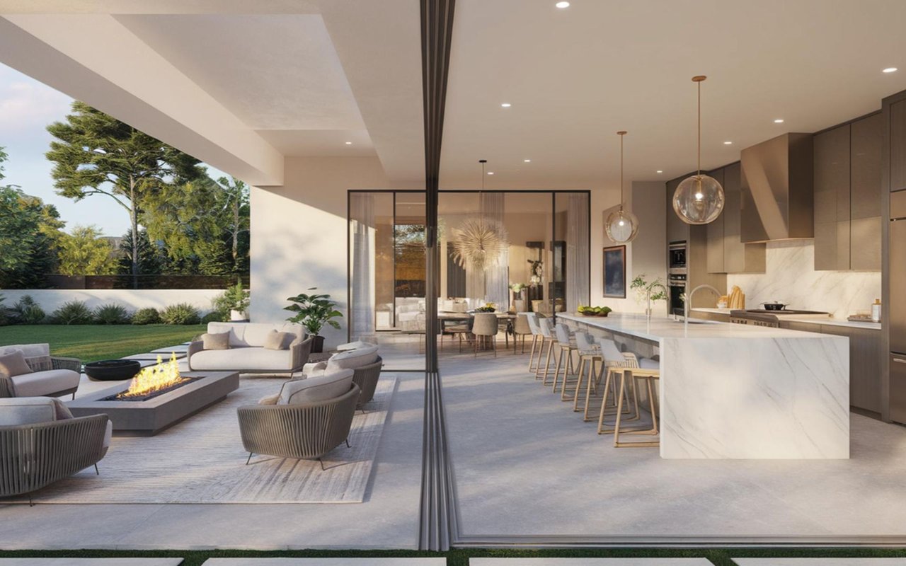
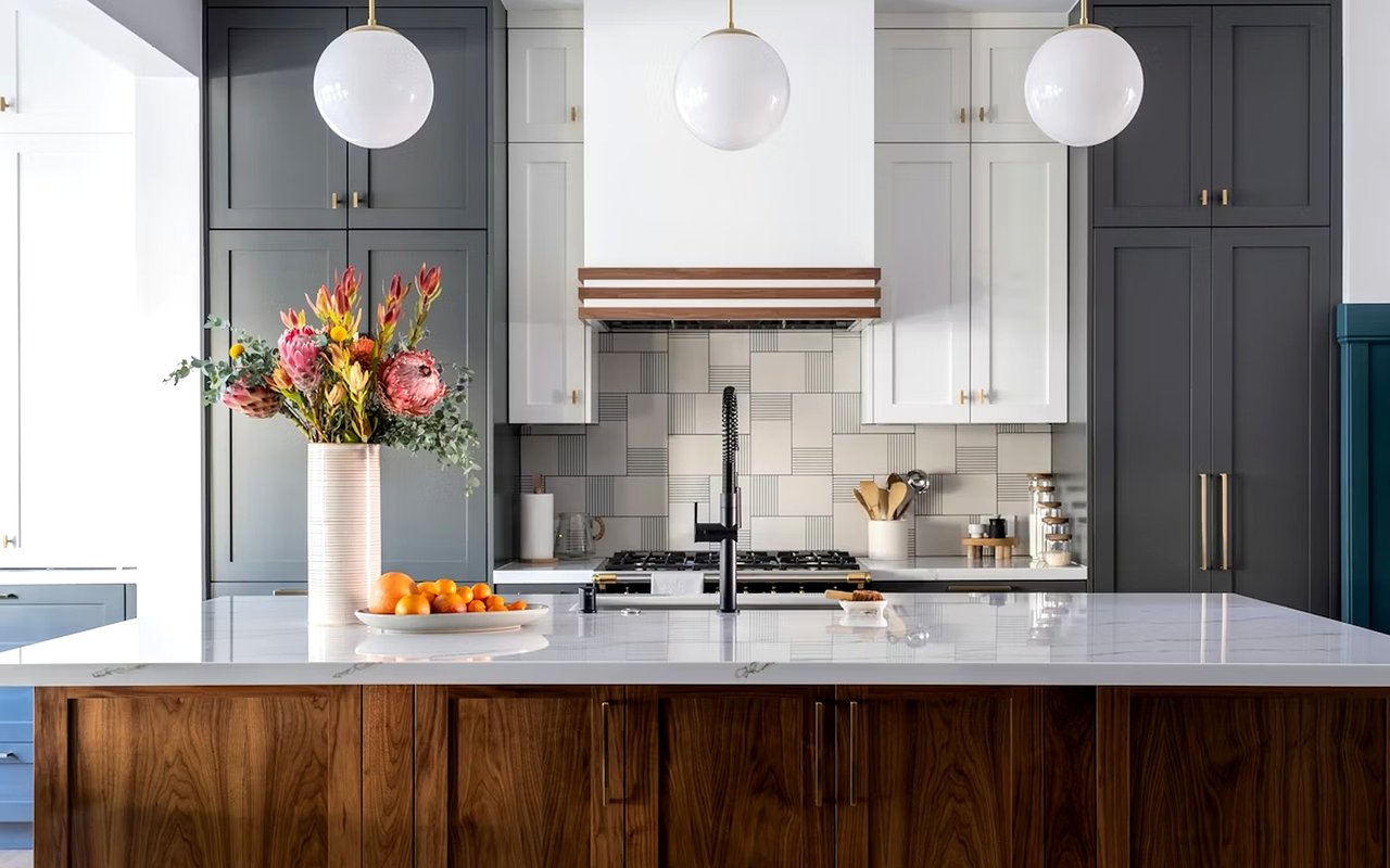
Kitchen
Your kitchen is a high-activity zone where color can spark energy and creativity. Light sage greens, soft blues, or creamy yellows offer a fresh, clean appearance while still adding personality. If you prefer a modern aesthetic, opt for a charcoal or navy accent wall paired with white cabinetry and metallic hardware for balance.
Dining Room
Rich, moody colors work exceptionally well in dining areas. Deep navy, forest green, or even a muted plum can create an intimate, dramatic effect, especially when paired with elegant lighting. In Beverly Hills homes, where entertaining is often elevated to an art form, the right color can transform your dining room into a showstopping setting.
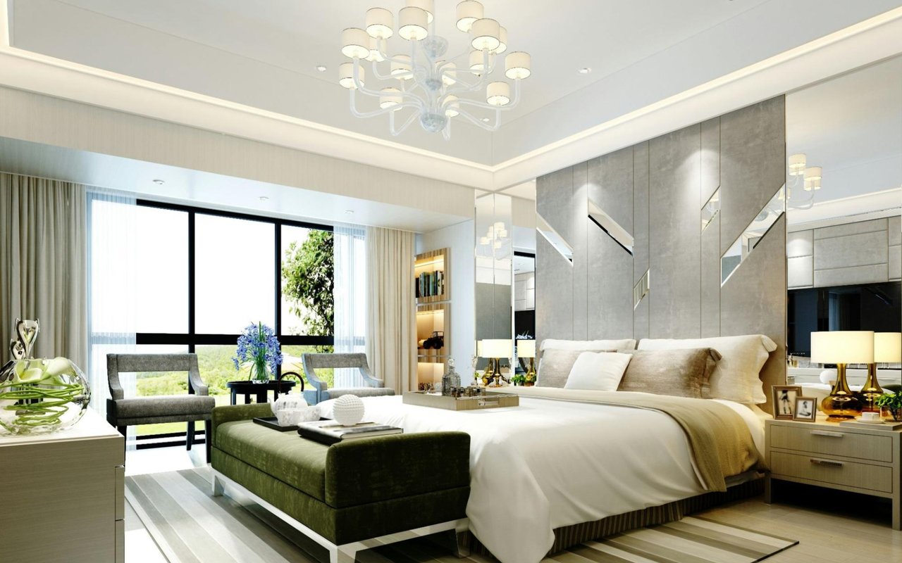
Bedroom
Your bedroom should be a quiet sanctuary. Choose soft, restful hues like dusty blue, lavender-gray, or a gentle ivory. These tones promote relaxation and work beautifully with plush textures and layered lighting. If your bedroom has high ceilings or dramatic architectural features, a darker accent wall can add dimension without overwhelming the space.
Bathroom
For bathrooms, crisp whites and soft aqua tones evoke a sense of cleanliness and calm. If you're aiming for a spa-like retreat, consider pale greens or warm sand tones. Avoid overly dark colors in small spaces unless you have strong lighting — but don’t shy away from bold design statements in powder rooms or guest baths, where creativity shines in compact formats.
Office Or Study
Color affects focus, so choosing the right paint for your office matters. Muted greens and blues are known to enhance concentration and reduce stress, while neutral tones provide a clean canvas that keeps distractions at bay. A charcoal backdrop or rich brown can add sophistication and gravitas to your work-from-home space.
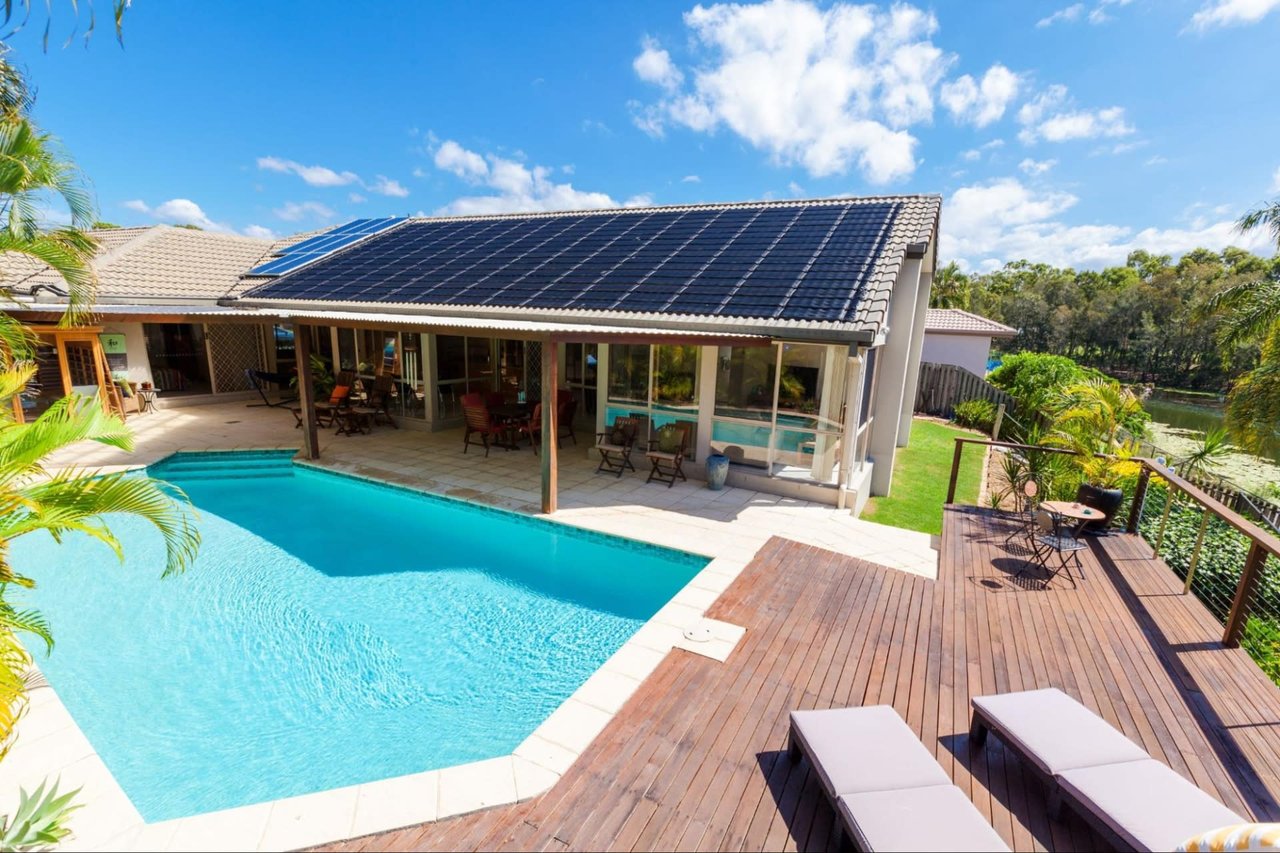
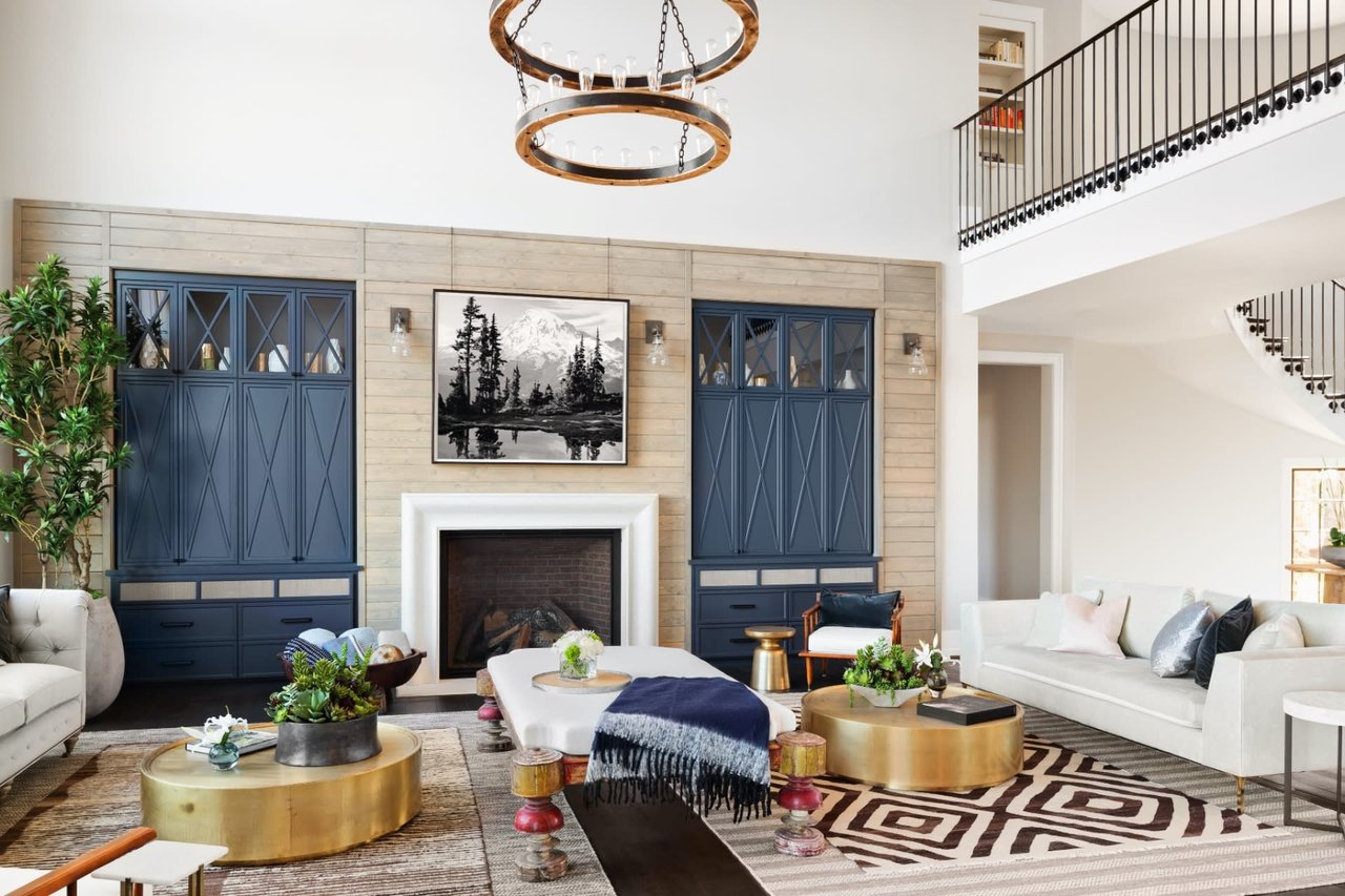
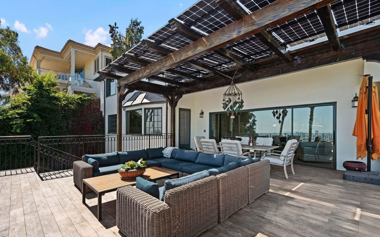
Accent Walls And Finishing Touches
Accent walls can create visual interest and highlight architectural features, but they should be used thoughtfully. Choose a wall that naturally draws the eye — behind a bed, at the end of a hallway, or along a dramatic fireplace. Select a color that’s deeper or bolder than the surrounding walls but still fits within your overall palette.
In a Beverly Hills home, where sophistication is key, accent walls work best when they enhance rather than dominate. Think about texture as well; matte finishes absorb light and feel soft and modern, while gloss finishes bounce light and add vibrancy.
Beyond the walls, don’t forget about ceilings and trim. A subtle color on the ceiling can elevate a space, while crisp white or contrasting trim makes architectural lines pop. These details create a layered, finished look that’s worthy of the most stunning interiors.
Make Color Work For You
Your home in Beverly Hills deserves more than just beautiful color; it deserves purposeful color. By approaching paint selection with thoughtfulness and creativity, you’ll build an environment that reflects your lifestyle, enhances your space, and adds to your home’s overall value and visual impact.
Remember, paint is one of the most powerful and cost-effective design tools available. With the right hues and a little knowledge, you can transform your surroundings and create something truly unforgettable. Connect with The Di Prizito Group when you’re ready to achieve your homeownership goals in Beverly Hills.
Remember, paint is one of the most powerful and cost-effective design tools available. With the right hues and a little knowledge, you can transform your surroundings and create something truly unforgettable. Connect with The Di Prizito Group when you’re ready to achieve your homeownership goals in Beverly Hills.